The colour you see on your screen is an interpretation, not a reality, causing a frustrating gap between what you buy and what arrives.
- Your phone’s « Vivid » mode is designed for punchy visuals, not accuracy, actively distorting fabric colours.
- Hardware like OLED screens can oversaturate shades, while software like Night Mode creates significant colour shifts.
Recommendation: Take control by switching your display to its « Natural » or « sRGB » profile and setting brightness to a comfortable, medium level in a neutrally lit room for the most trustworthy colour shopping experience.
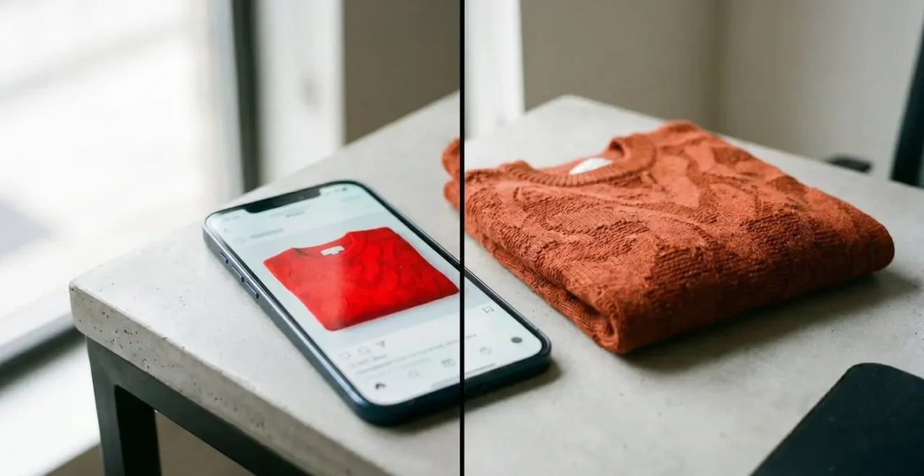
You’ve been there. You spot the perfect jumper online, a beautiful shade of terracotta red. You click, you buy, you wait. When the package arrives, you open it to find a jumper that’s… a dull, brownish orange. It’s a common frustration that fuels the costly cycle of online returns. As Josh Wayne, VP of Commerce Products, highlights, when a product arrives and it’s the wrong color, « It’s an immediate return, and can also result in low ratings and reviews, which impact future sales. » Many shoppers blame bad photography or poor lighting, but the real culprit is often the device in your hand.
As a digital colourist, I spend my days ensuring colour is consistent and accurate from camera to final screen. I’m here to reveal what’s happening behind the glass. Your phone’s screen is not a simple window; it is an active and often misleading interpreter of colour. It makes decisions based on factory settings designed to make games and videos « pop, » not to accurately represent the subtle weave of a linen shirt. This guide will pull back the curtain on the technology that’s tricking your eyes. We will explore why « Vivid » mode is your enemy, how to reclaim control with a « Natural » profile, and how to assess colour like a pro, regardless of your device. It’s time to restore your visual trust and make your next fashion purchase with confidence.
This article breaks down the core reasons for colour discrepancies and provides practical steps to see more accurate colours on your screen. Follow along to understand the technology and adjust your settings for a better online shopping experience.
Table of Contents: Why Your Phone Screen Lies About Colour
- Why Does « Vivid Mode » Make Red Jumpers Look Orange?
- How to Switch to « Natural » Profile for Accurate Online Shopping?
- The Night Mode Setting That Ruins Your Colour Perception
- OLED or LCD: Which Screen Tech Is Better for Buying Makeup?
- How High Should Your Brightness Be to Judge Fabric Colours?
- How to Set Your Screen Profile for Print-Ready Photography?
- Cinema Mode or Auto: Which Respects the Director’s Vision?
- sRGB vs DCI-P3:Apple Silicon vs Snapdragon: Which Chip Suits UK Power Users?
Why Does « Vivid Mode » Make Red Jumpers Look Orange?
The single biggest reason for colour disappointment stems from a feature designed to impress: « Vivid » or « Dynamic » screen mode. By default, many phones, especially those with vibrant OLED screens, are set to this profile. Its goal is to make the colours on your display look as punchy and saturated as possible. While this makes for a dazzling home screen, it’s a disaster for colour accuracy. This single issue is a major driver of returns; an industry analysis found that color discrepancies account for 16% of apparel returns.
This mode works by expanding the screen’s colour gamut—the range of colours it can display—beyond the standard for web content (known as sRGB). When a product photo, which is almost always saved in the sRGB standard, is displayed in this wide-gamut « Vivid » mode, the phone’s software artificially stretches those colours to fill the larger space. This is why a specific, intentional terracotta red can be pushed into a fiery, unnatural orange. The phone isn’t showing you the colour of the jumper; it’s showing you its own exaggerated interpretation of that colour.
As the visual above demonstrates, the on-screen « digital fabric » can appear glowing and hyper-real, while the actual material has a more subtle, textured tone. It’s a fundamental disconnect between digital marketing and physical reality. As the KTC Technology Hub explains it, « A high-contrast OLED may make a product photo look dramatic, but if it is running in an unmanaged wide-gamut vivid mode, standard web colors may appear oversaturated. » To see the truth, you must bypass this default enhancement.
How to Switch to « Natural » Profile for Accurate Online Shopping?
The most powerful step you can take to regain visual trust is to switch your phone’s display from its « Vivid » setting to a « Natural, » « Basic, » or « sRGB » profile. This simple change instructs your screen to stop exaggerating colours and instead display them as the photographer and designer intended. This profile constrains the display’s wide gamut to match the sRGB standard used for virtually all images on the web, ensuring a much more accurate representation.
You can typically find this setting under Settings > Display > Screen Mode or Colour Profile. The exact path varies by manufacturer, but the goal is to find the option that promises accuracy over vibrancy. The importance of this was highlighted in a real-world event. As one case study revealed, Samsung faced consumer backlash when its Galaxy S24’s « Vivid » mode was less saturated than the S23’s, because Samsung had applied more accurate colour management controls. This proves how much these default settings influence perception on a massive scale. By choosing the « Natural » profile, you are proactively opting for the more accurate rendering that manufacturers are slowly moving towards.
At first, the screen might look muted or even « dull » in comparison. This is a good sign. It means your eyes have adapted to the hyper-saturated world of « Vivid » mode. Give it a day or two, and you’ll find that the « Natural » setting feels more restful and, most importantly, more trustworthy. The colours you see will be far closer to the true colour of the physical product, drastically reducing the chances of a surprise when your package arrives.
Your Checklist for True-to-Life Colour Shopping
- Find Your Profile: Go to your phone’s display settings and switch from « Vivid/Dynamic » to « Natural/Basic/sRGB ». This is your new baseline.
- Neutralize Your View: Turn off any « Night Mode, » « Eye Comfort Shield, » or « True Tone » features before making a colour-critical purchase.
- Set Your Brightness: In a room with neutral, indirect daylight (not in direct sun or a dark room), adjust your screen brightness to about 50-70%, where it feels comfortable but not dazzling.
- Cross-Reference Clues: Look for descriptive colour names in the product description (e.g., « Forest Green » instead of just « Green ») and check customer photos in the reviews, which provide real-world context.
- Compare on Another Screen: If possible, view the product on a different device, like a laptop or a family member’s phone (also set to Natural mode), to triangulate the most likely true colour.
The Night Mode Setting That Ruins Your Colour Perception
While « Vivid » mode is an intentional marketing choice that distorts colour, there’s another popular feature that wreaks havoc on your perception for a completely different reason: Night Mode. Known as Night Shift on iPhones, Night Light on Android, or Eye Comfort Shield on Samsung devices, this feature is designed to reduce blue light emissions in the evening to supposedly help with sleep.
It achieves this by applying a warm, yellow-orange overlay to your entire screen. While potentially more comfortable for late-night reading, it’s a disaster for colour-critical tasks like shopping. This warm filter dramatically alters the « white point » of your display, the reference against which all other colours are perceived. A white shirt will look cream, a cool blue will appear greenish, and a neutral grey will take on a sepia tone. The effect is not subtle; scientific analysis shows this is a significant alteration. Research using linear transformation matrix models shows that Night Shift mode can cause a colour shift of approximately 15 degrees in hue, which is a massive deviation when trying to judge a specific shade.
If you are browsing for clothes in the evening with this setting enabled, you are guaranteed to be seeing an inaccurate version of the product. That elegant navy blue dress might look murky and almost black, while a delicate blush pink could appear as a peachy beige. It’s crucial to remember to disable any and all night mode settings before you make a purchase. Your goal is to see the « digital fabric » under the most neutral and standard conditions possible, and a heavy-handed colour filter completely undermines that effort.
OLED or LCD: Which Screen Tech Is Better for Buying Makeup?
Beyond software settings, the physical hardware of your screen plays a significant role. The two dominant technologies are LCD (Liquid Crystal Display), most commonly in its high-quality IPS form, and OLED (Organic Light Emitting Diode). While high-end phones have largely moved to OLED for its stunning contrast and vibrant colours, one isn’t definitively « better » for shopping—they simply have different strengths and weaknesses.
OLED screens achieve « perfect » blacks because their individual pixels can turn off completely. This creates an infinite contrast ratio that makes colours pop and gives images incredible depth. However, this same characteristic can lead to oversaturation, especially with reds, and can sometimes crush detail in the darkest parts of an image. A University of Ulsan image quality comparison study confirmed that OLED displays are perceived as more vivid and have a higher measured colorfulness metric than LCDs. This is great for watching movies, but for judging a foundation shade, it can be misleading. The high contrast can exaggerate skin texture and make subtle undertones appear more prominent than they are in real life.
High-quality IPS LCD screens, on the other hand, are backlit and known for their exceptional colour accuracy and consistency, especially when it comes to the sRGB standard. They don’t have the « infinite » contrast of OLEDs—blacks are a very dark grey—but their rendering of colour is often more predictable and stable. This is why creative professionals in print and design have long preferred calibrated IPS displays. For shopping, this often translates to more natural and reliable skin tone rendering, making them arguably better for matching foundation and other makeup products where subtle undertones are critical. The following table breaks down the key differences.
| Characteristic | OLED Displays | IPS LCD Displays |
|---|---|---|
| Color Gamut Coverage | Typically covers DCI-P3 and Rec.2020 (wider gamuts), resulting in richer, more saturated colors | Well-calibrated IPS covers sRGB accurately; high-end models with Quantum Dot can approach P3 |
| Color Accuracy Risk | Can overemphasize saturation, making colors look « too good » for reference work unless calibrated | Less prone to oversaturation; maintains consistent accuracy across screen with predictable performance |
| Viewing Angles | Near-perfect viewing angles (178°+) with no color shift; light emits directly from pixels | IPS: Excellent viewing angles (up to 178°) with minimal color shift; superior to VA/TN panels |
| Black Levels & Contrast | Perfect blacks (pixels turn completely off); infinite contrast ratio enhances perceived color accuracy | Blacks appear as dark gray due to backlight bleed; limited contrast can wash out dark colors |
| Professional Use Case | Ideal for video production, HDR content, media consumption where contrast and realism matter most | Gold standard for print work, color-critical applications, UI design requiring long-term stability |
| Makeup/Skin Tone Rendering | High contrast can exaggerate texture; may make foundation shades look different on screen vs. real face | More natural, predictable skin tone rendering; better for foundation finder tools and color matching |
How High Should Your Brightness Be to Judge Fabric Colours?
One of the most common pieces of advice is to « turn up your screen brightness, » but this is an oversimplification. While a screen that’s too dim will certainly obscure colour and detail, a screen that’s too bright can be just as misleading. When you max out the brightness, you can « clip » the highlights, meaning the brightest parts of an image lose all detail and become flat white. This can wash out subtle textures in fabrics like silk or satin and make pastel colours appear almost white.
The real key is not just screen brightness, but the relationship between screen brightness and your ambient lighting. Viewing your phone in a dark room will make the screen’s colours appear overly intense and luminous. Conversely, viewing it in direct, bright sunlight will wash out the colours and make them seem faded. The ideal viewing condition is a neutrally lit room with indirect daylight. In this environment, you should set your screen brightness to a level that feels comfortable to your eyes—typically around 50% to 70% of the maximum. It should be bright enough to see details in the shadows of the product photo but not so bright that it’s dazzling.
Because retailers cannot control your screen brightness, savvy brands have started using a clever workaround: evocative, relational colour descriptions. When a brand replaces a generic label like ‘green’ with ‘deep forest green, like a pine needle in shade,’ they are giving your brain a crucial anchor. This description helps you build a more accurate mental image of the colour that isn’t solely dependent on the flawed representation on your screen. As a shopper, learning to look for and trust these detailed descriptions can be as important as tweaking your screen settings.
How to Set Your Screen Profile for Print-Ready Photography?
While you, the shopper, are on one side of the screen, a photographer and a retoucher are on the other. Understanding how professionals ensure colour accuracy reveals the « gold standard » you should aim for with your own settings. In the world of professional photography, especially for e-commerce where product returns are a major cost, everything revolves around a concept called a « colour-managed workflow. »
The entire goal of this workflow is to ensure that a product’s colour looks consistent from the moment it’s captured by the camera, through the editing process, and finally to how it’s displayed on a customer’s screen. The bedrock of this entire system is the sRGB colour space. While professional cameras can capture a wider range of colours, and premium screens can display more, sRGB is the universal language of the web. It’s the one colour space that virtually every browser and device, from a high-end laptop to a budget smartphone, is designed to display correctly. Professionals edit and export their final images in sRGB to ensure the most consistent experience for the largest number of people.
To do this, they don’t just trust their eyes; they use hardware calibrators to profile their monitors, ensuring their screen is displaying sRGB perfectly. They target a specific white point (D65, the standard for daylight) to avoid the warm or cool cast that can trick the eye. When you switch your phone to its « Natural » or « sRGB » profile, you are essentially trying to emulate this professional standard. You are telling your device to stop showing off its fancy wide-gamut capabilities and instead to faithfully reproduce the sRGB image that the photographer painstakingly prepared. As the experts at ScreenTester.io state bluntly, for e-commerce products, » inaccurate colors = higher return rates.«
Cinema Mode or Auto: Which Respects the Director’s Vision?
The conversation about accurate colour isn’t limited to static photos; it extends to the product videos that are increasingly common on e-commerce sites. Just as film enthusiasts debate « Cinema Mode » versus « Auto Mode » to respect a director’s vision, a similar principle applies to a fashion designer’s vision for their product. The goal is to see the colour and texture as the creator intended, but video introduces a whole new layer of technical complexity.
A fascinating case study involves video compression. The technology used to shrink video files for the web (codecs like H.264) handles colour information differently than the technology used for still images (like JPEG). To save bandwidth, video codecs often use a shortcut called « chroma subsampling, » which slightly reduces the resolution of the colour information in the video. This can create a jarring disconnect for a shopper: you see a product photo with perfect, subtle earth tones, and then play a video on the same page where the item’s colour appears slightly shifted or more saturated. For brands built on a specific colour palette, this technical mismatch can dilute their identity.
This reveals a crucial insight: even a brand’s own content can be inconsistent due to underlying technology. The « Auto » mode on your screen, much like on a TV, will apply its own processing—sharpening, smoothing, and colour enhancement—to everything it displays. A « Cinema » or « Filmmaker » mode, by contrast, is designed to turn all of that processing off to show the raw file. For shopping, the « Natural » or « sRGB » profile acts as your « Cinema Mode. » It’s your way of saying, « Turn off all the extra processing and just show me the data as it was meant to be seen. » It’s about respecting the « designer’s vision » by stripping away your screen’s unhelpful interpretations.
Key takeaways
- Disable « Vivid » or « Dynamic » screen modes; switch to « Natural » or « sRGB » for accurate web colours.
- Always turn off Night Mode (Night Shift, Eye Comfort) before making a purchase, as it heavily distorts colours.
- Screen brightness and ambient room light work together; aim for medium brightness in a neutrally lit room for the best judgment.
sRGB vs DCI-P3:Apple Silicon vs Snapdragon: Which Chip Suits UK Power Users?
For power users in the UK, often equipped with the latest iPhones or Samsung flagships, the technical battle happening inside their devices is particularly relevant. These premium devices boast beautiful screens that can display a colour gamut called DCI-P3, which is 25% wider than the standard sRGB, particularly in the reds and greens. This is where « The Gamut Gap » becomes a major issue. The vast majority of the web, including almost every product photo, exists in the smaller sRGB colour space. Your high-end phone, however, wants to show off its DCI-P3 capabilities.
This is where the chip—whether it’s Apple Silicon or a Snapdragon processor—comes in. Both are incredibly powerful and use computational photography and AI to « improve » what you see. When your browser is asked to display an sRGB image on a DCI-P3 screen, the chip and operating system have to manage that conversion. In « Vivid » mode, they do so by aggressively stretching the sRGB colours to fill the larger P3 space, resulting in the oversaturation we’ve discussed. In « Natural » mode, they intelligently constrain the display to act like an sRGB screen, providing accuracy. Therefore, for a UK power user, the choice between Apple and Snapdragon is less important for colour accuracy than the user’s own choice of screen profile.
Ultimately, sticking to an optimized sRGB workflow is the most robust strategy for e-commerce brands, as it ensures a predictable and consistent colour for over 80% of users. While serving P3-specific images to capable devices is technically possible, it adds enormous complexity and cost. For the savvy shopper, this means understanding that your expensive, powerful phone is trying to « help » by making colours richer, when what you really need is for it to be honest. The final, revealing truth, as noted by photographer Daniel Wilk, is that « Wildly saturated color often looks better to the casual eye than restrained, subtle color. Lust among the masses for saturation far outweighs the desire for precise control. »
| Aspect | sRGB Color Space | DCI-P3 Color Space |
|---|---|---|
| Market Coverage | 80%+ of users view content on devices that display sRGB correctly; universal baseline standard | Premium 20% of users (high-end iPhones, Samsung flagships, professional displays); sign of the future |
| Color Range | Narrower gamut; covers standard web colors accurately; designed for monitors and web content | 25% wider gamut than sRGB; extends further into reds and greens; designed for digital cinema |
| E-commerce Priority | Baseline MUST be a perfect sRGB master image; ensures color accuracy for the vast majority of customers | Optional: Serve P3-optimized images to capable devices via adaptive image delivery (adds complexity, CDN cost) |
| Business Challenge | Straightforward: Shoot and edit in sRGB, embed profile, deliver universally compatible images | Complex: Should we serve different images to different devices? Pros (better color for premium users) vs. Cons (massive overhead) |
| Computational Photography Impact | Modern phone chips apply AI sharpening/saturation when rendering images in browsers; uncontrollable variable | Same AI-driven processing applies; chips boost saturation regardless of source color space, reinforcing need for robust masters |
| Practical Recommendation | Stick to optimized sRGB for most e-commerce businesses; provides consistent, predictable color for 80%+ of users | Only consider P3 delivery if targeting luxury/premium market with high-end device dominance and resources for adaptive imaging |
Take control of your digital window. By switching to a « Natural » profile, managing your brightness, and understanding the technology’s limitations, you can close the gap between the « digital fabric » and the physical garment. Start applying these principles today to shop with more confidence and finally get the colour you paid for.