Designing accessible apps in the UK is less about ticking WCAG boxes and more about the human-centric principles that ensure legal compliance and unlock commercial value.
- Minimalist trends like small, low-contrast buttons actively exclude a significant and economically powerful user base with common conditions like arthritis or presbyopia.
- UK legal compliance, under the Equality Act 2010, hinges on providing “reasonable adjustments” for real-world conditions, including motor tremors and even situational impairments like one-handed use.
Recommendation: Shift your design process from mere rule-following to empathy-driven engineering, focusing on user-centric audits and ergonomic principles to create truly inclusive experiences.
For a UI/UX designer, the pursuit of a “clean” and “minimalist” interface is often the primary goal. We strive for aesthetic perfection, sometimes at the cost of usability. But in the UK, this approach is not just a design flaw; it can be a legal liability. The Equality Act 2010 isn’t just a document; it’s a mandate for empathy, requiring service providers—including digital ones—to make “reasonable adjustments” for people with disabilities.
This isn’t about compromising your design vision. It’s about expanding it. It involves moving beyond the abstract idea of “the user” and designing for real people with diverse abilities and in diverse situations. We often hear about colour contrast and alt text, but the most profound accessibility failures lie in the very mechanics of interaction: the size of a button, the stability of a navigation menu, the feel of a confirmation. Failing to address these fundamentals not only excludes millions of potential users but also ignores a significant market.
This article moves beyond the typical accessibility checklist. We will dissect common design trends that inadvertently create barriers and provide a framework for an audit-first mindset. You will learn not just what the WCAG rules are, but why they exist, how they translate into practical design decisions, and how to engineer an app that is compliant by design, not by afterthought. This is about designing for everyone, not as a limitation, but as the ultimate design challenge.
To navigate this complex but crucial topic, this guide breaks down the core issues into actionable sections. From understanding the frustrations of your users to mastering the technical standards, you will gain a comprehensive view of mobile accessibility from an auditor’s perspective.
Summary: A Practical Guide to Compliant Mobile App Design
- Why Are Small Buttons the #1 Complaint from Users Over 50?
- How to Audit Your App With VoiceOver Before Launch?
- The Navigation Trend That Excludes Users With Tremors
- Grey on White: Why Your “Clean” Design Is Unreadable Outdoors?
- How to Place Key Actions for One-Handed Use?
- How to Use Haptic Feedback to Navigate Your Phone Without Sight?
- Why Do Standard Touch Targets Fail Users With Tremors?
- How to Size Buttons for Users With Arthritis on Mobile?
Why Are Small Buttons the #1 Complaint from Users Over 50?
The complaint about small buttons is not a matter of preference; it’s a fundamental usability barrier rooted in physical changes associated with ageing, such as decreased fine motor control and presbyopia (age-related farsightedness). For a designer, dismissing this demographic is a significant commercial error. This isn’t a niche group; 93% of mobile phone users aged 55 to 64 in the UK used a smartphone in 2024. They are digitally active, engaged, and possess considerable spending power.
This economic power is often referred to as “The Purple Pound,” which represents the consumer spending power of disabled households. Ignoring the accessibility needs of this group means turning your back on what the Purple Pound represents: a spending power of £274 billion annually in the UK. Tiny touch targets are a direct barrier to this market. When a user cannot reliably tap “Add to Basket” or “Confirm Purchase,” they don’t just struggle; they abandon the transaction and the brand.
From an audit perspective, inadequate button size is a failure to provide a “reasonable adjustment.” It creates a high-friction experience that actively discriminates against users with common age-related impairments. The solution lies in treating touch target size not as a minor detail dictated by aesthetics, but as a critical component of inclusive infrastructure. It’s about ensuring the primary controls of your digital service are robust and forgiving for everyone.
Ultimately, designing larger, well-spaced buttons is not “dumbing down” the interface. It is a strategic decision to build a more resilient, profitable, and ethically sound product that respects the physical reality of a large and growing user base.
How to Audit Your App With VoiceOver Before Launch?
A common misconception among design teams is that screen reader testing is solely the domain of specialist QA testers or developers. This is a critical error. Performing a basic audit with screen readers like Apple’s VoiceOver (or Android’s TalkBack) should be a fundamental skill for any UI/UX designer. It provides direct, unfiltered insight into the non-visual experience of your app, revealing issues with navigation flow, information hierarchy, and control labelling that are invisible to sighted users.
An audit is not a vague exploration; it is a systematic process. The goal is to simulate the experience of a user who relies entirely on audio feedback to navigate. Does the focus order follow a logical path, or does it jump erratically around the screen? Are buttons announced as “Button” or as a meaningful action like “Submit form”? Is dynamic content, like a confirmation message, announced to the user, or does it appear in silence, leaving them in a state of uncertainty?
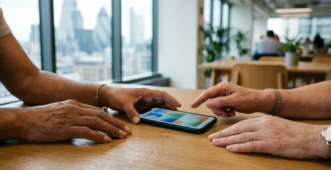
This paragraph introduces the concept of a systematic accessibility audit. To understand what this looks like in practice, the image below captures the hands-on nature of this essential testing process, blending device interaction with meticulous documentation.

As the image illustrates, this process is about careful, deliberate interaction. It’s about moving from the visual to the structural, ensuring every interactive element has a purpose that can be conveyed through sound. Integrating this audit into your pre-launch workflow is the single most effective way to catch critical accessibility blockers before they impact real users. It shifts the paradigm from fixing bugs to designing a fundamentally robust experience from the start.
Your Pre-Launch Audit Checklist: A Step-by-Step VoiceOver Guide
- Enable VoiceOver: Navigate to Settings > Accessibility > VoiceOver and toggle it on, or use the Siri command ‘Turn on VoiceOver’. Get familiar with the basic swipe and tap gestures.
- Navigate All Screens: Use single-finger right/left swipes to move sequentially through every element on every screen. Verify that all elements announce meaningful and concise labels.
- Test Focus Order: Confirm the VoiceOver focus order matches the visual layout logically (e.g., top to bottom, left to right). An illogical order is disorienting and a major barrier.
- Check Interactive Elements: Double-tap to activate all buttons, links, and controls. Ensure they perform the correct action and that any resulting change is announced.
- Verify Dynamic Content: Ensure VoiceOver announces new content that appears after user actions, such as error messages, loading indicators, or pop-up dialogues, so the user is never left guessing.
Running this audit doesn’t require you to be a VoiceOver expert. It requires empathy and a willingness to experience your own design through a different sensory channel. The insights gained are invaluable for building a truly usable and compliant application.
The Navigation Trend That Excludes Users With Tremors
In recent years, gesture-based navigation has become a hallmark of modern, “seamless” app design. Swiping from the edge to go back or pulling down to refresh are now second nature for many users. However, this trend presents a significant barrier for individuals with motor tremors, such as those caused by Parkinson’s disease or essential tremor. These complex gestures demand a level of fine motor control and stability that these users simply may not have, effectively locking them out of core app functionality.
The issue is the lack of an alternative. When a gesture is the *only* way to perform a critical action, the design becomes exclusionary. A user with a tremor may find it impossible to execute a smooth, continuous swipe without accidentally triggering other actions or failing the gesture entirely. This creates an experience of frustration and helplessness, directly contradicting the principles of inclusive design and the legal requirement for reasonable adjustments.
This isn’t a theoretical problem. With a significant portion of the population experiencing some form of motor impairment, particularly as they age, relying solely on complex gestures is a flawed strategy. The solution is not to abandon gestures, but to supplement them with simpler, more forgiving alternatives.
Case Study: The BBC’s Dual Navigation Approach
The BBC provides a masterclass in solving this issue. In developing their mobile accessibility guidelines for both native and hybrid apps, they implemented a dual-path navigation strategy. While retaining modern gesture-based controls for users who prefer them, they ensured that all functionality is also accessible through simpler, tap-based alternatives. This is often achieved with persistent bottom tab bars or clearly labelled buttons, providing a stable and reliable method of navigation for users with motor impairments. This approach doesn’t compromise the modern feel of the app; it enhances its robustness by offering multiple ways to achieve the same goal.
As a designer, the key takeaway is to always provide a simple, tap-based equivalent for any gesture-driven navigation. Think of gestures as shortcuts for power users, but ensure there is always a clearly marked, stable “main road” that anyone can use, regardless of their level of motor control.
Grey on White: Why Your “Clean” Design Is Unreadable Outdoors?
The minimalist aesthetic, often characterized by light grey text on a white background, is a dominant trend in modern UI design. It’s seen as sophisticated, clean, and professional. However, from an accessibility standpoint, it is often a failure. While a low-contrast design may look acceptable on a high-end monitor in a dimly lit design studio, it becomes completely unreadable in real-world conditions, such as on a smartphone screen under bright sunlight. This is a classic example of situational impairment, where the environment creates a temporary disability for the user.
The Web Content Accessibility Guidelines (WCAG) provide a clear, data-driven solution to this problem. The rules are not arbitrary; they are based on extensive research into human vision and legibility. For standard text, WCAG 2.1 AA standards require a 4.5:1 minimum contrast ratio for text smaller than 18 points. This is not a suggestion; for many organisations, it’s a legal requirement. In the UK, the Public Sector Bodies (Websites and Mobile Applications) Accessibility Regulations mandate this level of compliance for public services.
Failing to meet this standard doesn’t just alienate users with low vision; it impacts everyone. A user trying to read directions on a sunny street, a commuter on a train with screen glare, or anyone using an older device with a less vibrant screen will struggle with a low-contrast interface. The “clean” design suddenly becomes a frustrating, unusable mess.
As an auditor, finding inadequate contrast is one of the most common—and most easily fixed—failures. It is a measurable, objective standard. There are countless free tools available online to check the contrast ratio between two colours. Integrating this check into the earliest stages of brand palette selection and UI design is not an extra step; it is a fundamental part of a professional workflow. Choosing a slightly darker shade of grey is a small price to pay for an application that remains usable for everyone, everywhere.
Therefore, you must challenge the assumption that low contrast equals sophistication. True elegance in design comes from clarity and usability, not from a visual trend that fails the moment it leaves the controlled environment of your design software.
How to Place Key Actions for One-Handed Use?
As smartphone screens have grown larger, one-handed use has become increasingly difficult. This creates another form of situational impairment that affects nearly all users at some point—whether they’re carrying shopping, holding onto a rail on public transport, or holding a child. Designing for one-handed use is not just an accommodation for a specific disability; it is a core tenet of modern mobile ergonomics. The top corners of a large phone screen are effectively a “dead zone” for the thumb of the hand holding the device.
Placing critical interactive elements like a “confirm” button, a primary navigation link, or a “submit” action in these hard-to-reach areas forces users into awkward and unstable hand gymnastics. They must either use a second hand or shift their grip, risking dropping the device. This increases both the physical and cognitive load of using the app, creating unnecessary friction.
Effective ergonomic design is based on understanding the natural arc of the thumb. The most accessible area—the “green zone”—is the bottom portion of the screen. This is where primary actions, frequent controls, and navigation elements should be placed. The following image demonstrates this principle clearly, showing the natural reach of a user’s thumb.
As shown, the thumb has easy, comfortable access to the bottom third of the screen. This is why bottom tab bars and floating action buttons (FABs) in the lower-right corner have become such effective and popular UI patterns. They align with the natural physiology of how we hold and interact with our devices. Placing secondary or less-frequent actions, like settings or profile icons, in the harder-to-reach top areas is an acceptable trade-off, but core functionality must always be within easy reach.
Your role as a designer is to make the user’s journey as seamless as possible. By placing key actions within the thumb’s reach, you reduce physical strain and decision time, creating a more efficient and pleasant experience that works with the user’s body, not against it.
How to Use Haptic Feedback to Navigate Your Phone Without Sight?
For most designers, the user interface is a purely visual medium. We focus on pixels, colours, and layout. But for users with significant visual impairments, and indeed for all users in certain contexts, the interface is also a tactile landscape. Haptic feedback—the use of vibration and other physical sensations—is a powerful but often underutilised tool for creating a richer, more informative, and more accessible user experience.
When used thoughtfully, haptics can provide non-visual confirmation that an action has been successfully completed. Imagine a user activating a toggle switch. A subtle “click” sensation from the phone’s haptic engine provides immediate, unambiguous feedback that the state has changed. This is invaluable for a screen reader user who might otherwise have to wait for the audio confirmation. It builds confidence and speeds up interaction, reducing the motor-cognitive load of navigating the app.
Moreover, haptics can be used to convey information and add texture to the UI. A stronger vibration could signify a destructive action like “delete,” prompting the user to be more cautious. A short, sharp buzz could confirm a successful data sync. Google’s Material Design guidelines explicitly recognize haptics as a key component of an intuitive interface. This is not just a gimmick; it’s a distinct communication channel.
Under the UK’s legal framework, ensuring an equivalent experience for all users is paramount. While the WCAG standards are primarily focused on visual and auditory presentation, the spirit of the Equality Act 2010 calls for a holistic approach. Providing tactile feedback is a form of reasonable adjustment that can make a digital service substantially more usable for someone navigating without sight. It bridges the gap between a user’s action and the system’s response in a way that sound alone cannot always achieve.
As a designer, you should start thinking about your interface’s “feel.” Collaborate with developers to implement haptic feedback not as a random effect, but as a meaningful system of signals that confirms, alerts, and guides the user. This turns your app from a flat glass surface into a dynamic, responsive object.
Why Do Standard Touch Targets Fail Users With Tremors?
When a user with a motor tremor attempts to interact with a standard-sized touch target, they face a double challenge that goes beyond simple accuracy. The failure is not just about “missing the button.” It’s about the immense motor-cognitive load that small, unforgiving targets impose. This load has two parts: the physical difficulty of landing the fingertip on a precise location, and the mental stress of anticipating and correcting for involuntary movements.
A user with a tremor cannot produce a simple, linear “tap.” Their finger’s path to the screen may be erratic. A small touch target demands a level of precision that they cannot reliably produce. This leads to a high “miss rate,” where the user either taps the empty space between buttons or, even more frustratingly, activates the wrong control. Each miss is not just a failed action; it’s a moment of frustration that erodes confidence and can lead to a complete abandonment of the task.
This problem is amplified by the design of the interface itself. Standard touch targets are often designed with only minimal spacing between them. For a user with a tremor, this lack of a “buffer zone” turns the UI into a minefield. The act of trying to hit one button becomes a risky gamble that might trigger an adjacent, and potentially irreversible, action. This forces the user to slow down, to concentrate intensely on a simple physical act, and to expend significant mental energy on a task that should be effortless.
From a legal and ethical standpoint, this is a clear failure to provide a reasonable adjustment. The interface is effectively punishing the user for their disability. The solution is not just about making buttons bigger, but about designing a more forgiving system. This means larger targets combined with generous spacing, creating an environment where a near-miss is still a success, and the cognitive load required for basic interaction is drastically reduced.
Ultimately, designing for users with tremors requires a shift in mindset: from designing for perfect, precise inputs to designing for the messy, unpredictable reality of human movement. This leads to a more robust and usable interface for everyone.
Key Takeaways
- Legal Compliance is User-Centric: Meeting UK standards like the Equality Act 2010 is less about technical checklists and more about providing “reasonable adjustments” for real human conditions.
- Accessibility is Economic: Ignoring accessibility means excluding the “Purple Pound”—a £274 billion market in the UK. Poorly designed features like small buttons are a direct barrier to revenue.
- Audit Proactively: A designer’s job includes performing basic audits with tools like VoiceOver. This shifts accessibility from a reactive fix to a proactive design principle.
How to Size Buttons for Users With Arthritis on Mobile?
For users with arthritis, the simple act of tapping a screen can be painful and difficult. The condition can cause joint stiffness, swelling, and a loss of fine motor control, making precise actions challenging. When designing for this group, the size of a touch target is not a matter of aesthetics; it is a direct determinant of whether your app is usable or a source of pain and frustration. A small button requires a level of precision that can be physically impossible for someone with limited dexterity in their hands and fingers.
For years, designers have relied on platform-specific guidelines, such as Apple’s 44×44 points and Android’s 48x48dp. These have been excellent rules of thumb. However, the official accessibility standards have now evolved to provide more granular requirements. The recently introduced WCAG 2.2 standard directly addresses this issue in its Success Criterion 2.5.8, “Target Size (Minimum)”. To meet Level AA compliance, the new WCAG 2.2 standard requires interactive targets to be at least 24 by 24 CSS pixels.
While 24×24 pixels is the new minimum for compliance, it should be seen as a baseline, not a target to aim for. The more stringent Level AAA recommendation remains 44×44 CSS pixels. For users with conditions like arthritis, bigger is always better. A larger target reduces the need for pinpoint accuracy, allows for a less precise tap, and minimizes the chance of hitting an adjacent control by mistake. This dramatically lowers both the physical and cognitive effort required to use the application.
To help designers navigate these different standards, the following table provides a clear comparison of the minimum and recommended target sizes across WCAG and major mobile platforms. This data is essential for making informed, compliant design decisions, as highlighted in a recent comparative analysis.
| Platform | Minimum Target Size | Recommended Size | Conformance Level |
|---|---|---|---|
| WCAG 2.2 Level AA | 24×24 CSS pixels | 44×44 CSS pixels | AA Baseline |
| WCAG 2.5.5 Level AAA | 44×44 CSS pixels | 48×48 CSS pixels | AAA Enhanced |
| Apple iOS | 44×44 points | 48×48 points | Platform Standard |
| Android Material Design | 48x48dp | 48x48dp | Platform Standard |
As an ethical and compliant designer, your goal should be to exceed the minimums. Aiming for the Level AAA or platform-recommended sizes of 44-48dp is the most effective way to ensure your app is comfortable and usable for people with arthritis and other motor impairments. It’s a simple change that makes a world of difference.